 The Only Bean
🟥 Red Card for Greasy Snacks
About this email
Captured Promotional
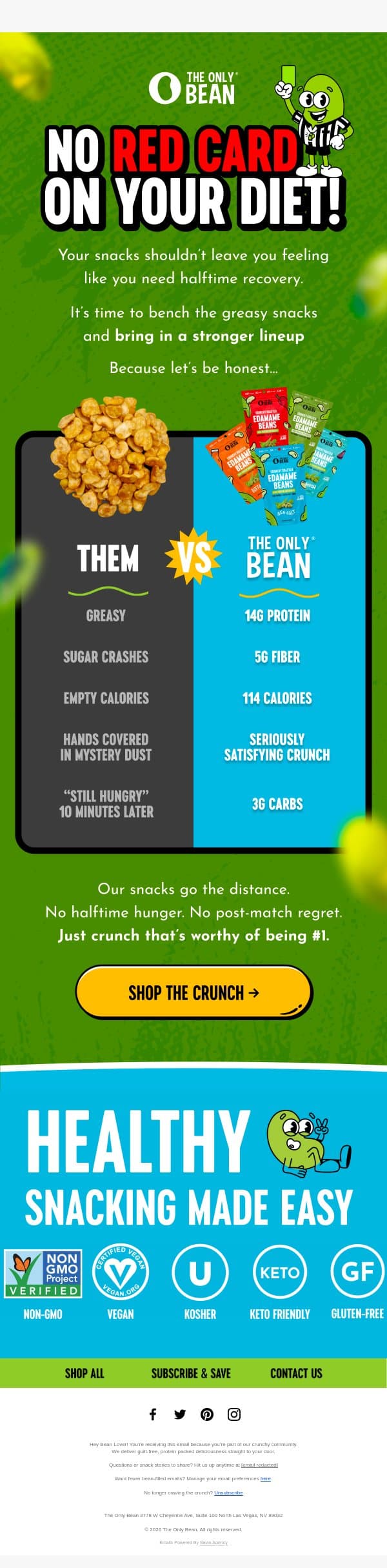
A playful comparison email highlighting the health benefits of The Only Bean snacks versus traditional greasy alternatives.
The email uses a vibrant green and blue color scheme with a central comparison table. The logo is at the top, followed by a headline, a 'Them vs Us' comparison graphic, a clear CTA button, and a section highlighting product certifications.
Color palette
Original email and brand assets belong to their respective owners. Design notes describe the creative, not campaign results.