
Real life. An unexpected point of view.
Real life.
A fresh perspective.
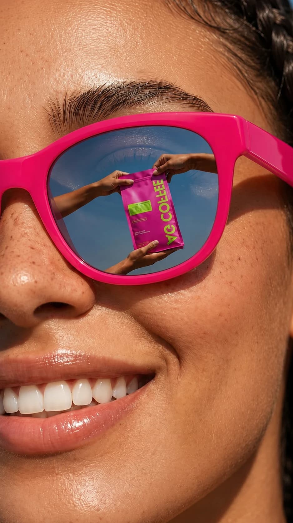
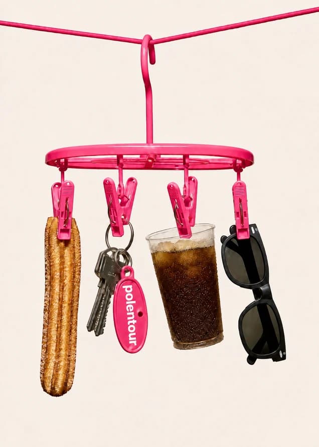
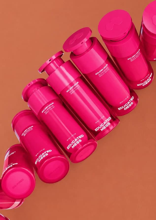
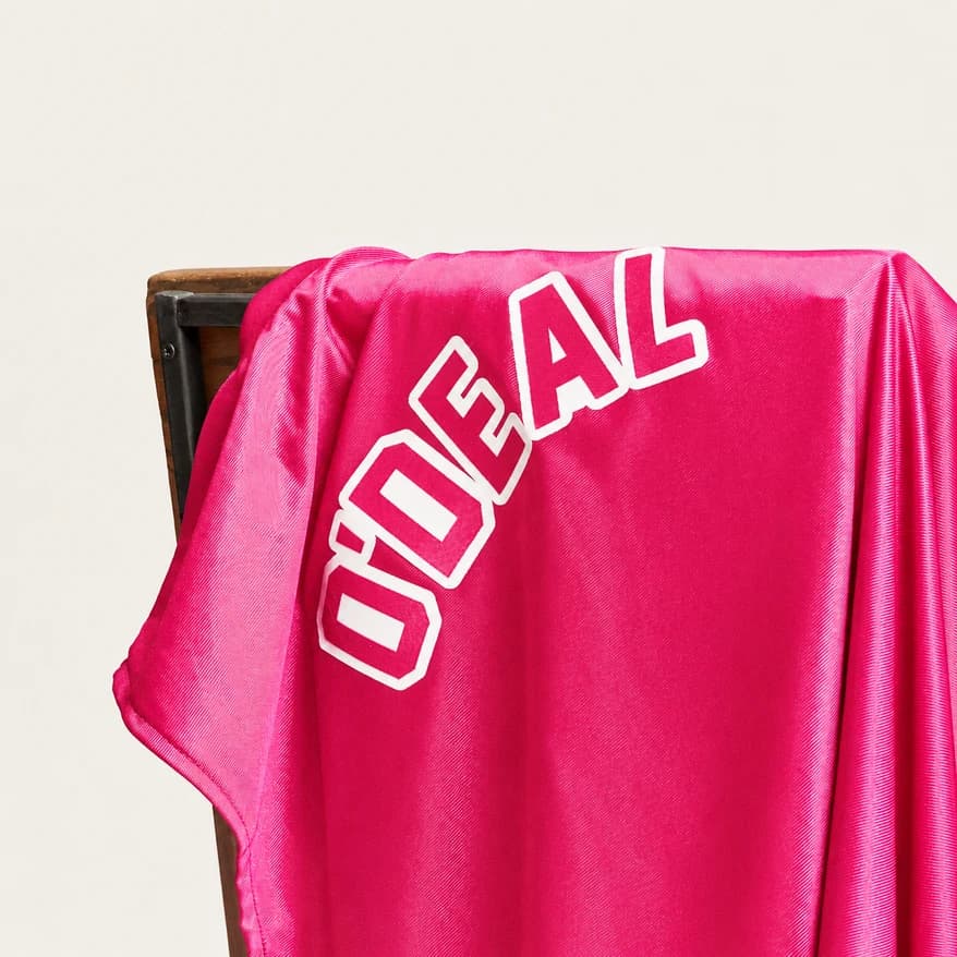
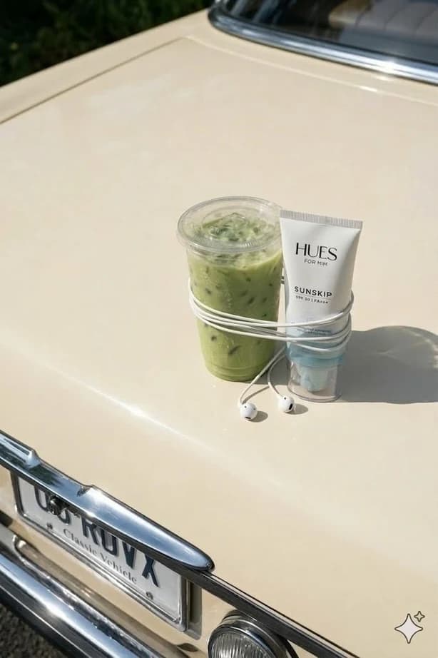
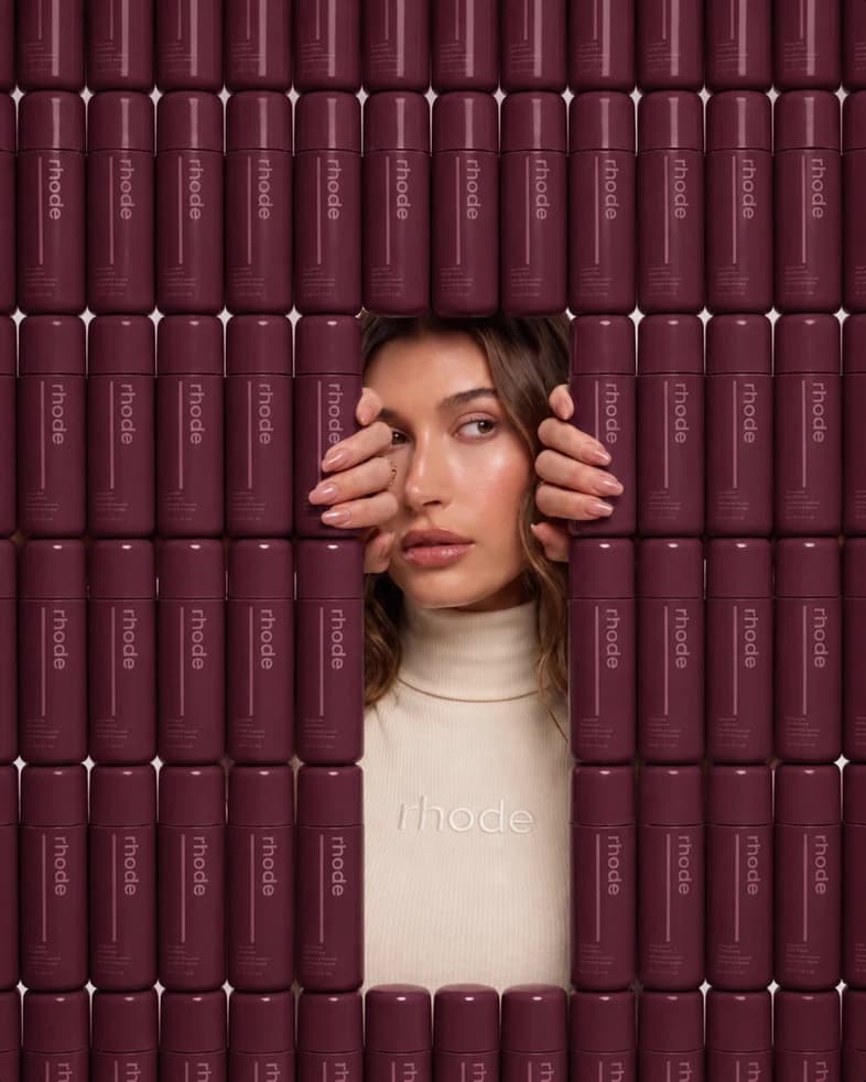
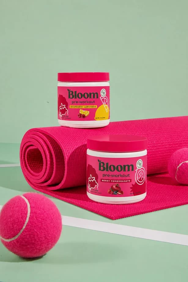
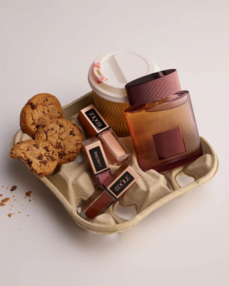
Our images make the ordinary feel worth another look. A playful object. A joyful crop. Pink appearing in an unexpected place. Warm light and tactile details keep it human.

Our starting point.
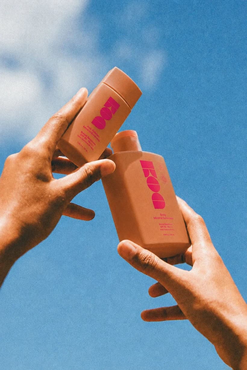
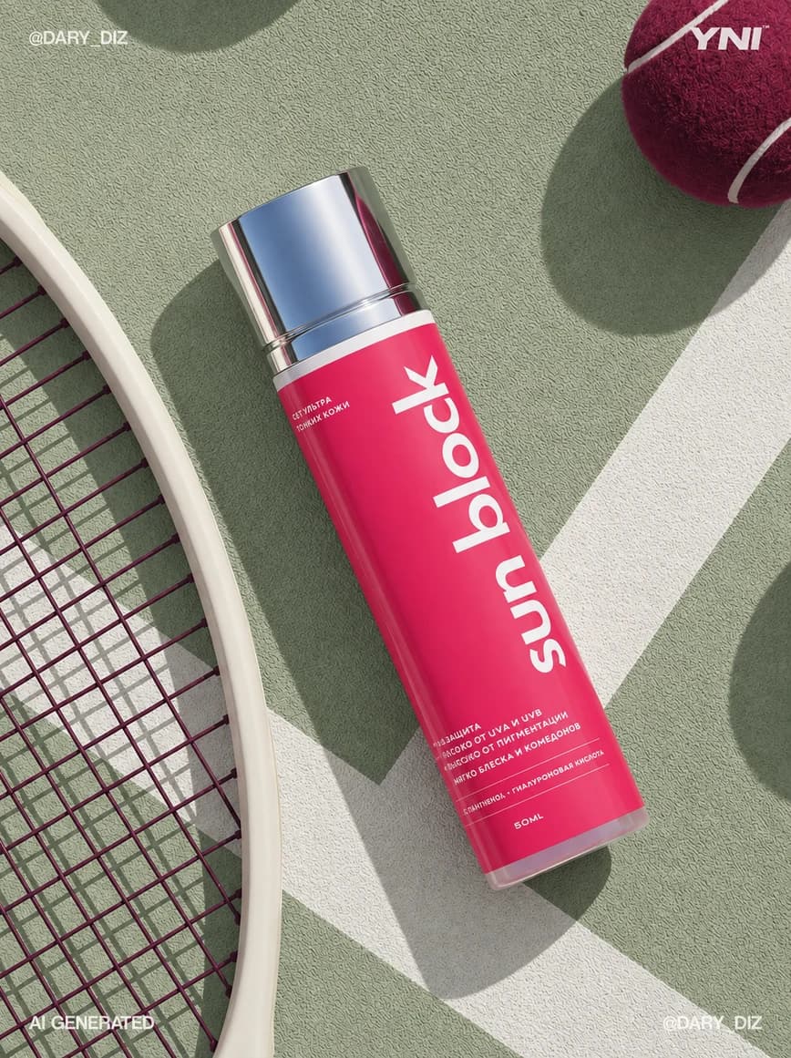
The visual references from our rebranding mood board: expressive people, everyday objects, rich materials, and a confident flash of pink.

A feeling you
can almost touch.
Find the unexpected in the familiar.
An ordinary object with a surprising role or scale. Keep the visual idea simple enough to understand at a glance.
Make the light feel real.
Favor sunlight, honest shadows, rich textures, and natural skin. Keep the human imperfections that make an image feel alive.
Let color have a purpose.
Build around our warm neutrals. Use Pink as a signature detail, with Sage, Plum, and Terracotta supporting the scene.

Keep the world believable.
Avoid generic office stock, floating technology symbols, glassy 3D objects, and images that try to explain everything at once. If an image uses AI, review the details, keep it honest, and never present it as a real customer or real product result.