One unmistakable mark. Space to be itself.
A small mark.
A big personality.
 Migma
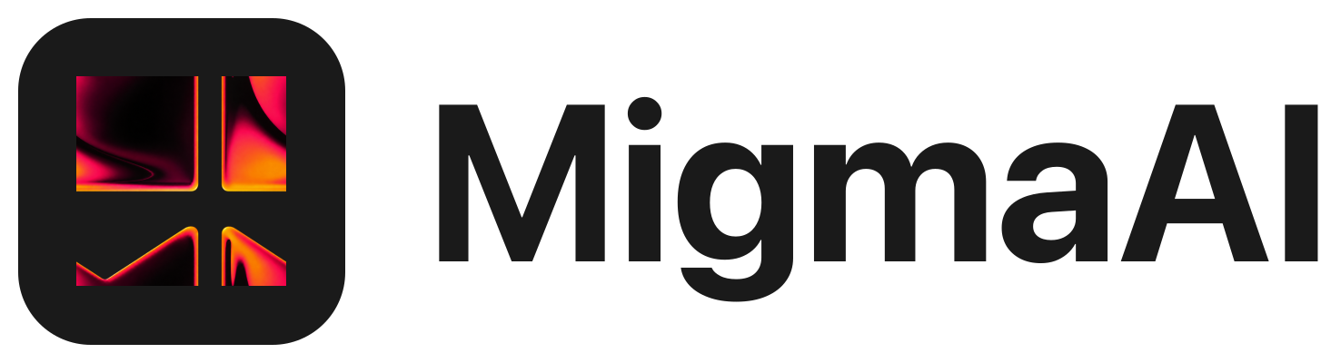
MigmaOur folded M is our signature. Use the original artwork, including its precise shape, color, and proportions. The gradient mark brings energy; monochrome versions keep things clear when color isn’t available.

Give it some room.
Keep a clear area of at least half the mark’s height on every side. Use the full lockup when the name needs to be read. Use the standalone mark where Migma is already familiar.
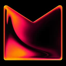
Keep the mark at least 24 pixels tall on screen. At smaller sizes, use the supplied favicon assets.
Keep our signature intact.
Keep the proportions.
Never stretch, rotate, crop, or redraw the mark.
Keep the colors.
Use the supplied gradient or monochrome versions. Don’t add outlines, shadows, or new effects.
Keep it visible.
Use a calm area of the image or a solid background. The mark should never compete with a busy photograph.
Ready to use.
The brand kit includes our logos, wordmarks, app icons, and favicon files.
Download the Migma brand kitSVG, PNG, WebP, and icon assets · ZIPBrowse individual assets