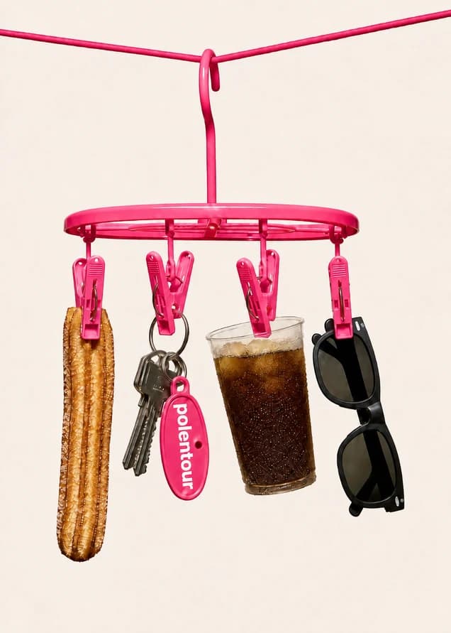
Make room for what matters.
One clear idea.
Every layout starts with the thing we want someone to remember. One headline, one visual, one clear next step. Give those elements a confident hierarchy and the rest can fall into place.
Good ideas
need room.
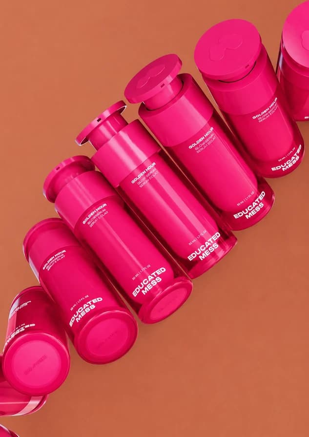

A brighter
kind of workday.
A little structure.
A lot of possibility.
Start from the edges.
Use generous, consistent margins. Align headlines, copy, and images to the same underlying grid.
Let imagery do its job.
Use bold crops and simple image shapes. Pair a close-up with a wide view to create a change of pace.
Keep the message in focus.
Put copy in a quiet area of the image or on a solid field. Never sacrifice readability for a composition.
A brighter
kind of
workday.
Your good ideas.
A little more time.
Space is part
of the message.
Alternate expressive moments with quiet ones. A full-bleed photograph can be followed by a simple line on Cream. On small screens, stack the same elements in their natural reading order and keep the idea intact.