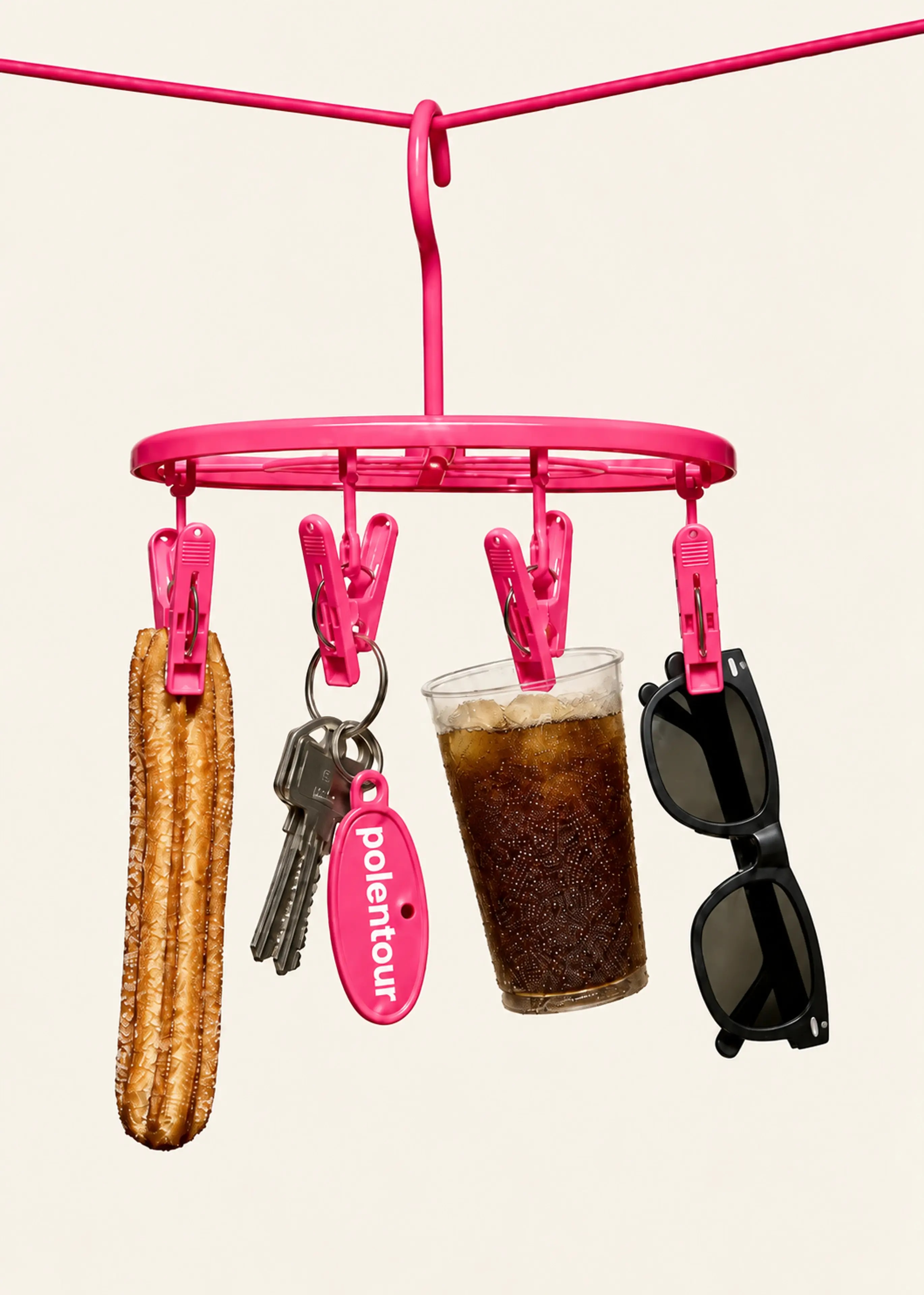
Big ideas. A distinctive voice.
Our typefaces.
One voice with character. One that keeps things clear. Migma Display brings the personality; a simple sans serif makes the details easy to read.
Migma Display
AaBbCc
123&!?
Supporting sans
AaBbCc
123&!?
Use Arial or Helvetica for brand copy and the system sans serif in our product. Reserve Migma Display for headlines, with the real italic cut for a little emphasis.
Give every line room.
Set headlines close enough to feel like one thought. Give paragraphs more breathing room. Start with these settings, then check the actual words at the size people will read them.
Make room
for good ideas.
- Display size
- 80–160 px
- Section size
- 40–72 px
- Line height
- 95–105%
- Letter spacing
- −2% to −4%
Use two or three purposeful lines. Break at a natural pause, and scale the size down for smaller screens.
One voice. More ways to use it.
Let the same pairing travel from a campaign to a small announcement. Change the scale and the pace, while keeping a clear first read.
Less busywork.
More you.

Your good ideas. A little more time.
Meet your next
favorite feature.
A small change to your day.
A big difference to your flow.
Find the right rhythm.
Alignment sets the mood. Start from a clear edge for everyday copy, center a short statement, or offset a few words for a more playful moment.
Make room
for what
matters.
Our everyday starting point. Keep the headline, supporting copy, and action on the same left edge.
Color gives words a feeling.
Cream and Ink keep the message clear. Pink brings the energy. Use high contrast for small copy and save expressive color for the big words. Check readability at the final size.
Room to
think.
Made to
matter.
A little
bolder.
Good things
ahead.
Misuse
Keep our typography consistent and easy to read. Avoid these settings when working with Migma type.
Migma Display brings character to a headline. For longer paragraphs and small details, let our supporting sans serif do the work.
Too tight
Too
loose
Don’t
add new
fonts.
DON’T
SHOUT!
Don’t
right-align
copy.